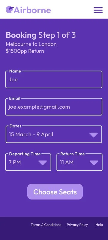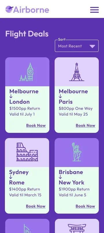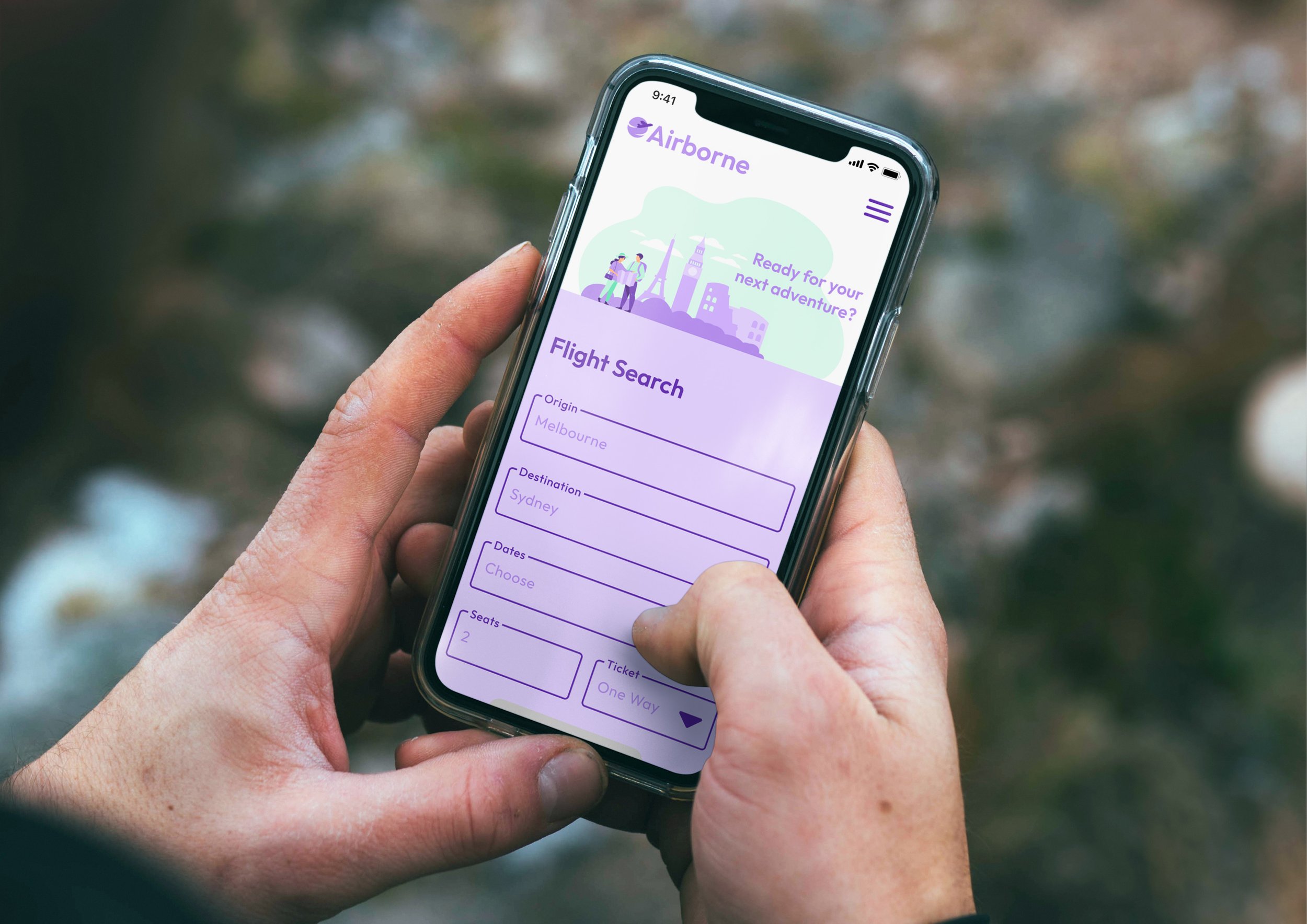
Mobile Checkout User Flow
My Role
Solo UI designer and UX tester. 2022 RMIT student project for the User Interface Design short course.
Background
Airline company offering ultra-comfortable economy flights, looking to create a website that highlights current flight deals and the in-flight experience. User personas and LoFi Wireframe were supplied.
Artifacts/Deliverables
• Moodboard informing design aesthetics
• User flow diagram
• Component library
• User testing Insights
• High Fidelity prototype
Timeline
6 weeks
Results
Feedback from course tutor, Christina Zsori:
A strongly laid out user flow and great progression of your components to screens. Your presentation was professional and clear. It was nice to have you take us on the journey of how you made decisions, how you took your feedback insights and kept pushing to make your design as good as possible. Lots of respect for that attitude. Your Figma file and prototype is of a very high standard.
Moodboard
Discovery stage
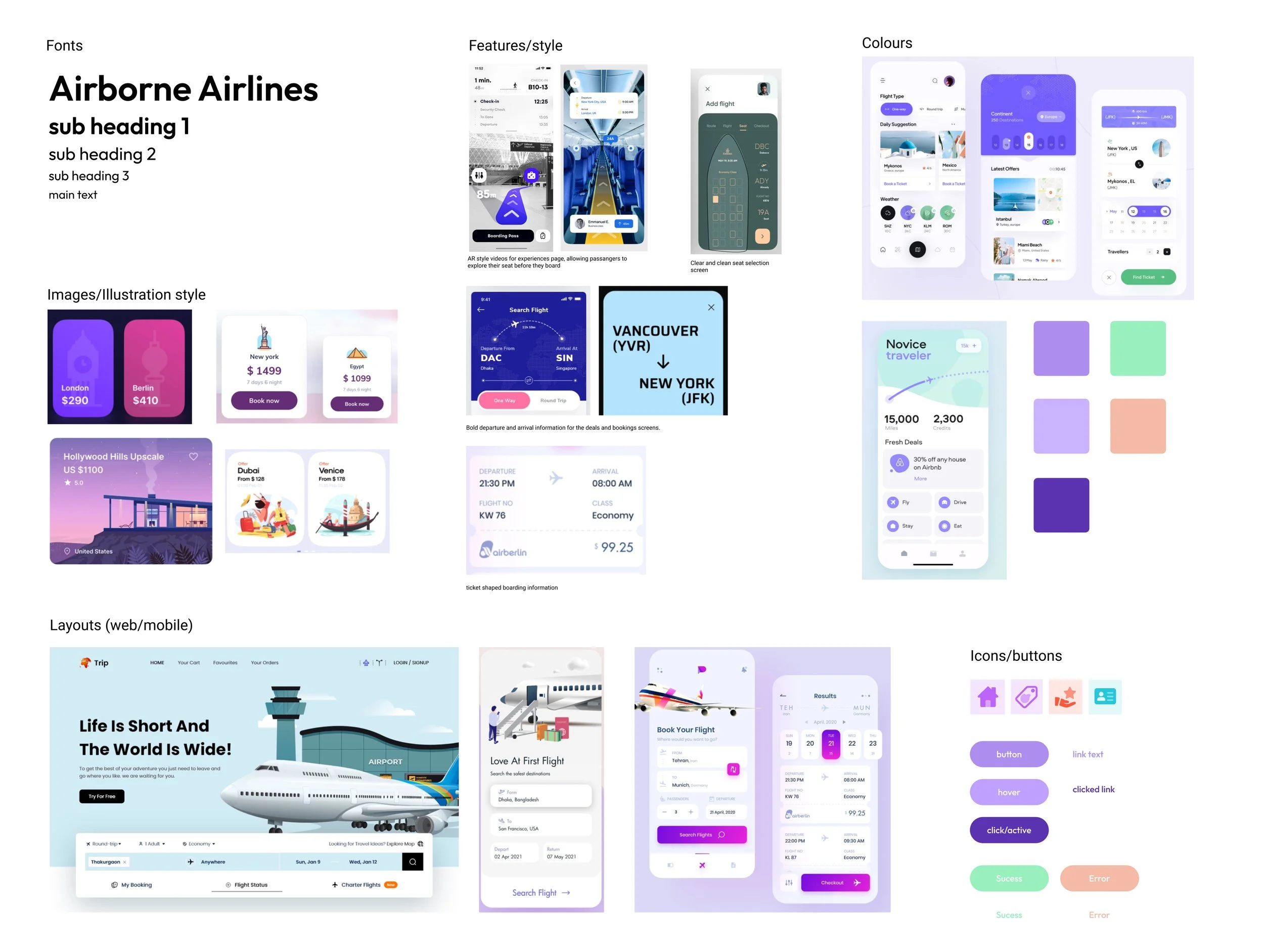
A mood board was created to collate a wide variety of potential UI inspiration. This process examined the wider market that Airborne would need to compete in and showed where it could stand out from the crowd visually.
The focus was on layout, colours and illustration styles. The goal was to create a look that was clean, futuristic, friendly and relatable. The final colour selection was tested to meet web accessibility standards.
User Flow
Define Stage
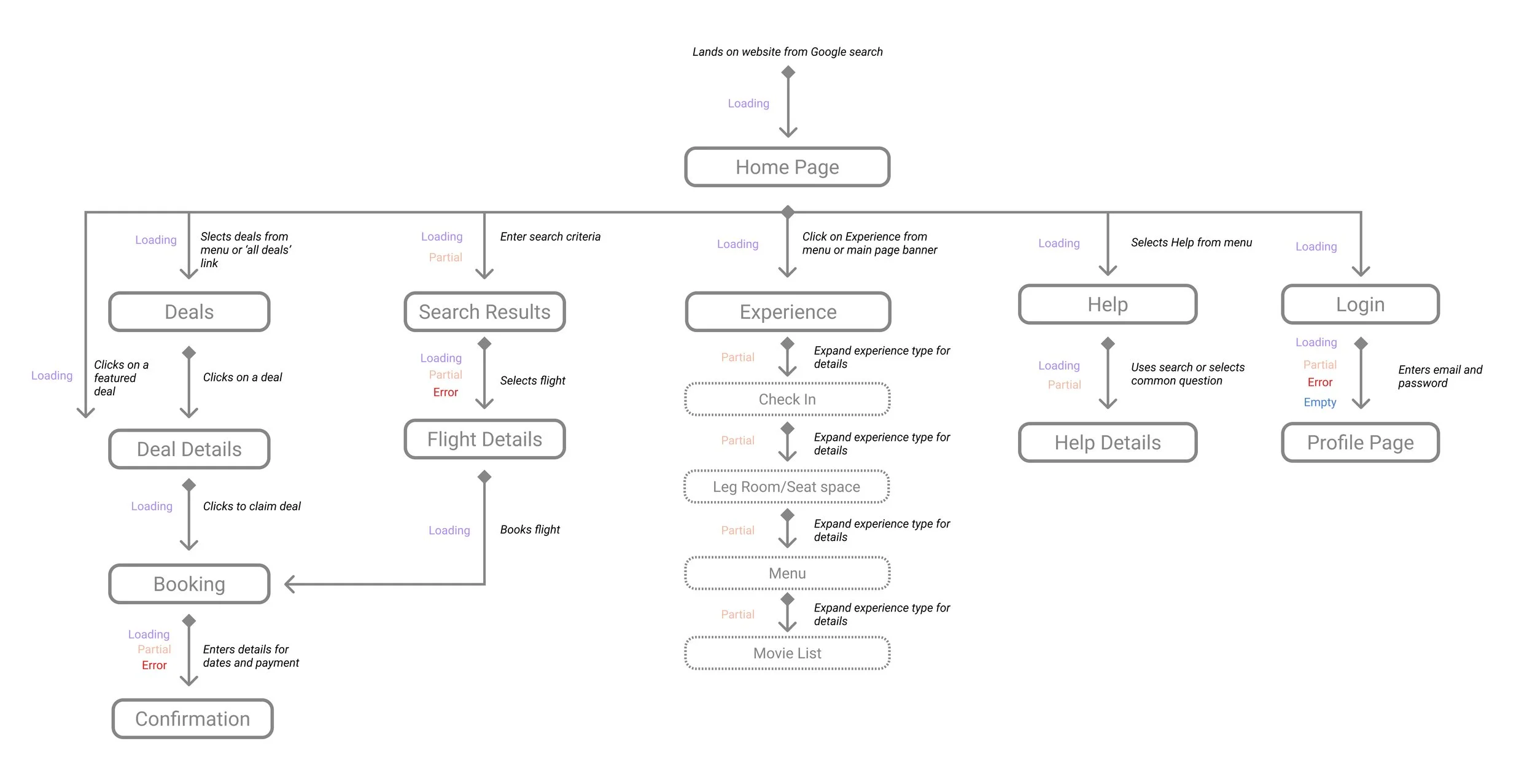
A user flow was created to outline all the pages prototype would include. This helped to visualise the relationships between pages, gave structure to navigation requirements and an overview of which pages would need multiple states.
Component Library
Develop stage
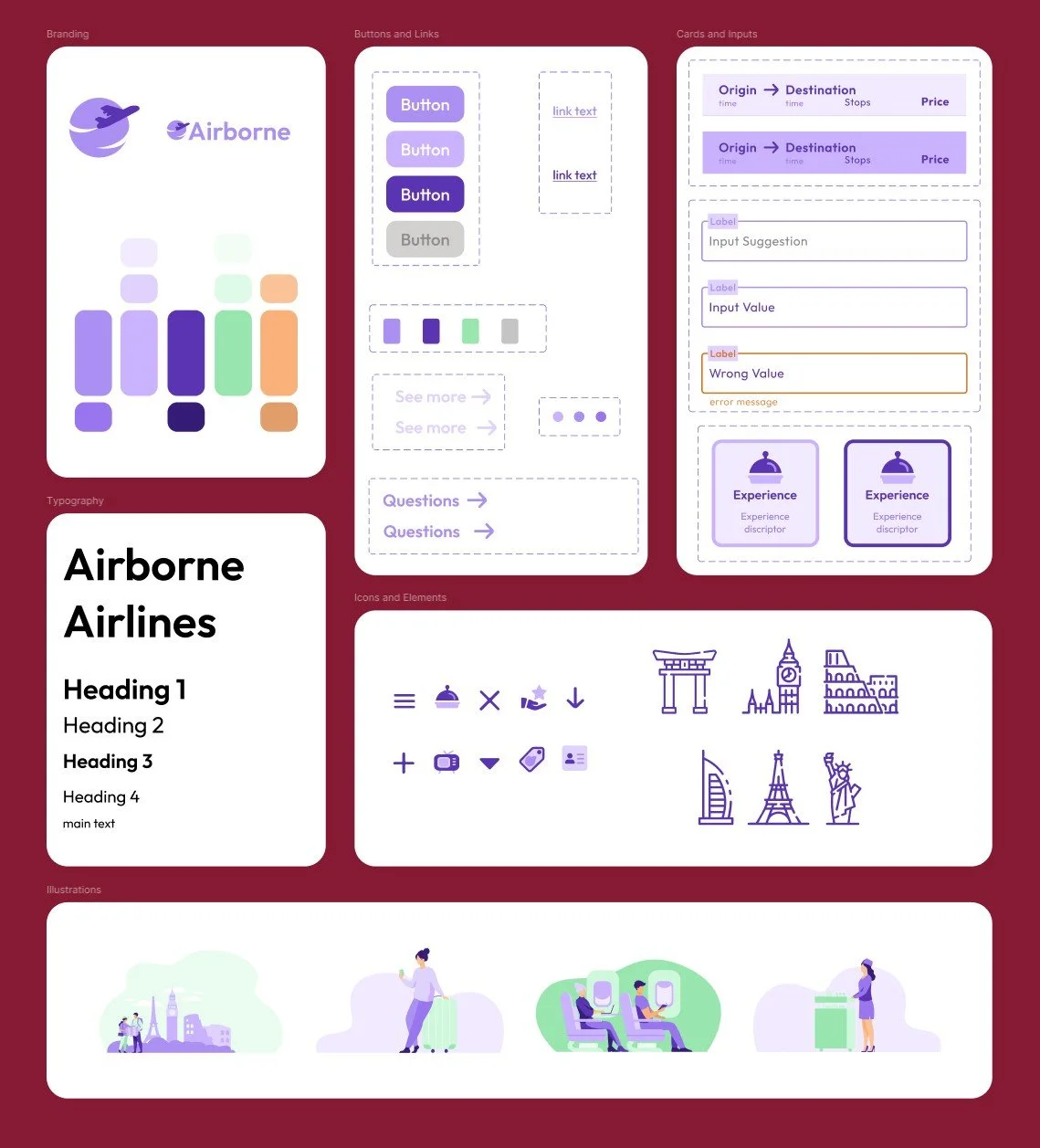
Producing a component library ensured consistency across the design and functioned as a style guide when new items were required.
It also allowed for rapid and easy adjustments app wide when responding to user feedback. The colour pallet was expanded to allow for different component states and meets WCAG AA accessibility standards.
User Testing
Develop stage
The prototype was tested with 2 users over Zoom. The tasks were designed to uncover any issues with the site layout and architecture, as well as the ticket booking flow and general aesthetics.
The feedback given was broadly positive, especially in relation to finding information. Actionable suggestions and comments allowed the next iteration of the prototype to be clearer and more useful for users. The screens below show the changes made as a direct result.
Task One
Please explore the home page for this app, and describe what you see as you scroll. What first impression is the brand giving you?
Task Two
Where might you look on this website to find out how much legroom you can expect during a flight?
Task Three
Please attempt to book the Melbourne to London Flight deal, all personal details will be prefilled with sample data, this task is just assessing the process of booking. Please talk through each new page and step in the process, and describe what are you seeing.
Feedback
The site looks really clean & easy to use.
There is a lot of purple, I would like to see more of this green being used, they really complement each other.
Some of this text is hard to read, could there be more contrast?
I want to see how many steps are left when going through the booking process, if I stepped away or were comparing sites, I’d want to know where I got up to.
Responsive Prototype
Deliver stage
The final prototype made in Figma can be found below. User testing showed that it met the business goals of giving prominence to both flight deals and the in-flight experience.
The next steps to progress this project further would involve targeted research and testing of the flight search features, as these are currently limited in their scope. Comprehensive competitor analysis of this feature would be valuable before proceeding.


