Website Architecture Research
My Role
Solo UX Researcher, contract facilitated by Harness Projects
Client
Green Connect is social enterprise tackling issues of unemployment, waste management, and food production with a sustainable mindset on the local level. They operate an urban farm staffed by disadvantaged workers, offering fresh produce to the local community, and provide local businesses with ethical labour hire & waste management planning services.
Brief
Green Connect was seeking recommendations to improve website structure and usability after several years of organic and ad hoc site changes. Due to the range of services they provide, this also included assessing how to best communicate their unique business model, allowing different target audiences to easily access services relevant to them.
Solution
Research revealed a significant misunderstanding of Green Connect’s services by new visitors to the site. To resolve this problem and increase website usability I gave the following recommendations:
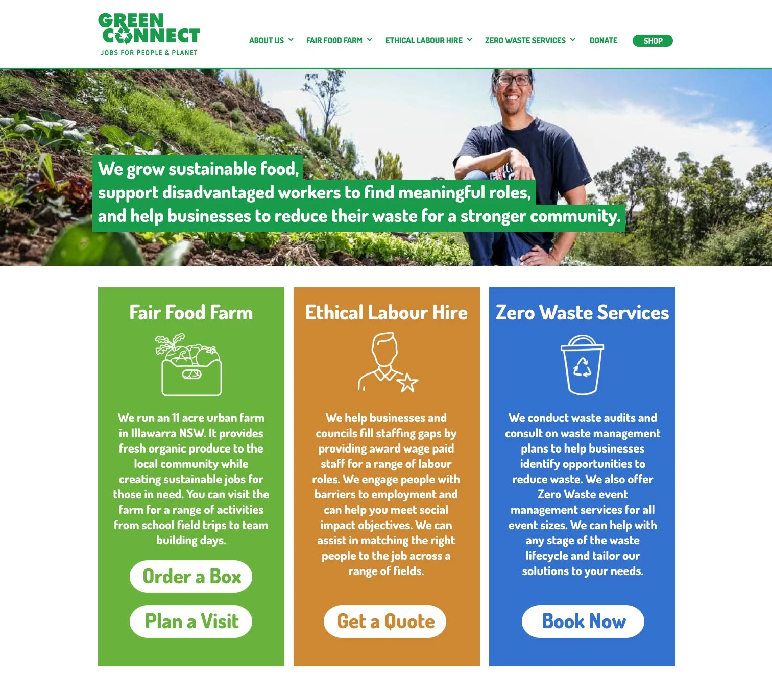
• Redesigning the homepage to lead with a clear value proposition, followed by a concise description of each service and a relevant call to action.
• Simplify and streamline the menu to align with the core services and make more navigation intuitive.
• Introduce usability best practice navigation features such as breadcrumbs and hover responses.
Timeline
6 weeks
Results
The research report was presented to Louise Manner, the website manager for Green Connect. She was interested in the site map created during the project and the quotes from completely new visitors to the site. She spoke to how intertwined all of the services are, making them difficult to separate, but agreed that the research showed this was an aspect of the site that required attention.
Sitemap
Discover stage
In order to address the brief, a comprehensive understanding of the current site structure was required. To fulfill this, a sitemap was created because it allowed for a singular visual overview, which would highlight problem areas to focus in on for further research. This map shows every link from the homepage and main menu to at least one step, including external links.
Insights
The sitemap revealed a bloated menu structure with 30 sub menu links. There were a further 19 links within the body of the homepage, and 6 seperate links directing users offsite to the Shopify store for purchasing produce boxes.
This process also uncovered two different pages titled ‘What We Do’ with live links in different locations. Some menu items linked to event pages with out of date information, and all of the submenus under ‘Visit’ linked to different sections of the same secondary page.
This process also uncovered a series of broader usability issues, missing system feedback and unclear navigation within parts of the site, particularly the blog.
Card Sorting
Discover Stage
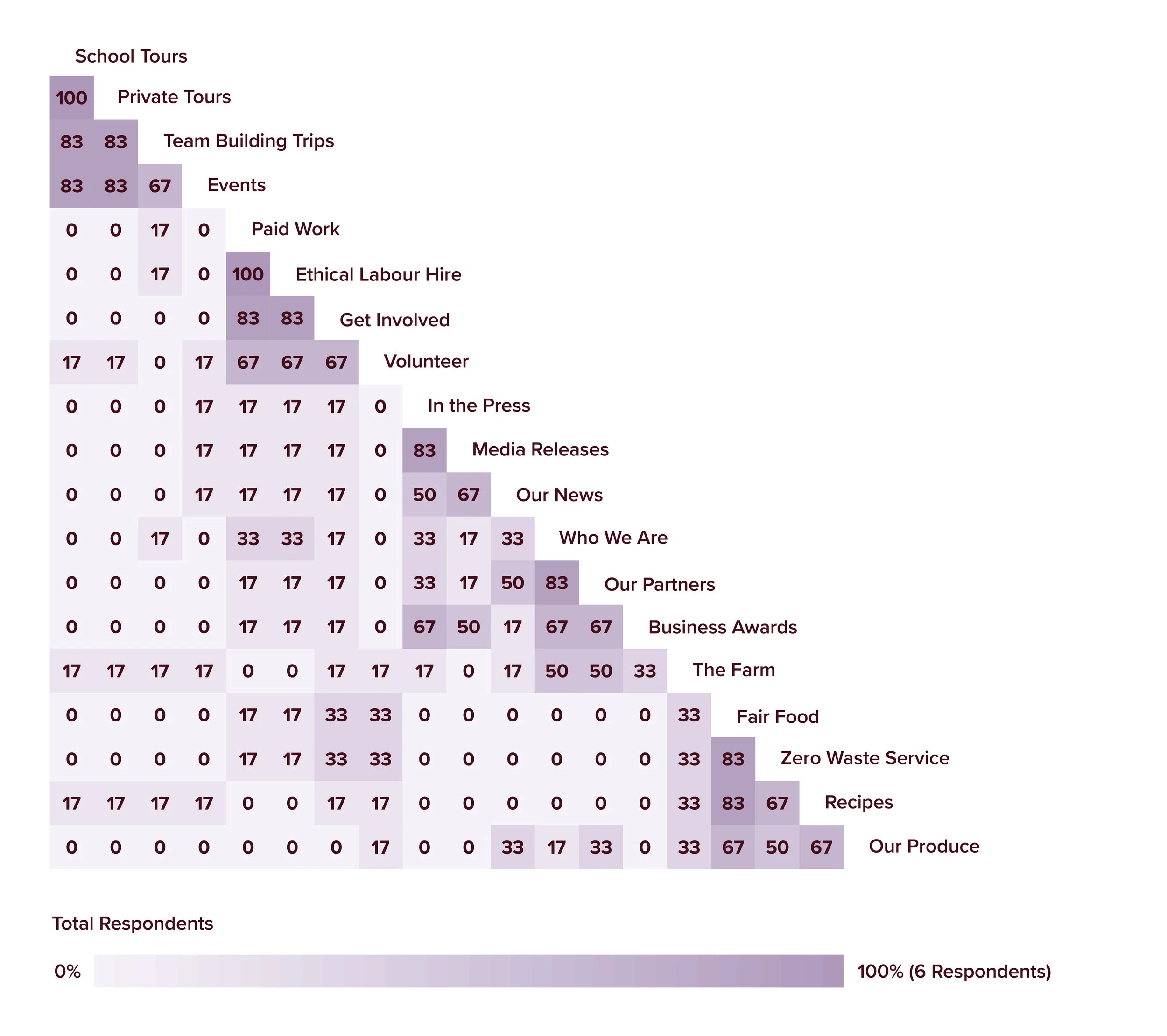
The sitemap indicated that the menu was potentially a point of confusion for users. To test this assumption, a card sorting task was developed using the sub menu titles. References to Green Connect were removed where necessary and replaced with something generic to maintain task integrity. Additionally some menu items were removed due lack of relevance (eg. Covid-19 sub menu) or due to significant overlap in content (eg. Green Connect News and Zero Waste News just became Our News) to This left a total of 19 menu items for the task.
6 participants were recruited, 2 male and 4 female with an age range of 31-65. The task was conducted online using the UXTweak platform.
Insights
While there were pockets of consistency in grouping menu items, broadly the similarity matrix confirms the current sub menu items are not intuitive to users.
Participants also directly reported their confusion, expressing a difficulty to group items or to know the difference between items.

“The categories felt added on, as if not-for-profit grew without a collective idea, there didn’t seem to be a sense of order, or design.”
“What’s the difference between In the Press, Media Release and Our News? What’s the difference between Paid Work and Ethical Labour Hire?”
“They can have eighteen “Look how good we are!” green things on their website. But if out the back door, they have their hand out to the petrochemical companies. Then everything on their website is just so much greenwashing.”
“If I'm researching the object I'm gonna buy, anyway, I'll also research the company. But if it's like an impulse thing. I won't go as deep.”
User Interviews
Discover stage
Insights
The interviews revealed quite a large overlap in values, with participants organically mentioning the importance of fair wages and sustainable practices that minimise waste. Funding transparency and evidence of impact also came up when speaking about trusting charities and non-profits.
The ordered ranking task further supported this, with the top three values being:
Employment support for disadvantaged groups. Engaging in projects for social good over profit. Commitments to zero waste.
Interviews were conducted to highlight the overlap in values between users and Green Connect. This would provide a direction for crafting more effective value statements.
Two target market users were questioned on their values and how this impacts purchasing decisions, especially for weekly groceries. They were also asked about ethical businesses and how they trust or validate claims by places they support charitably. Participants completed an ordered ranking of values associated with Green Connect’s mission, from most to least important.
“I would not participate in the cycle of fast fashion...It's everything from the mistreatment of workers to all of these, artificially created fabrics, they're terribly carbon intensive processes that go into making them. And then they're only worn 5 times and then create methane as they decompose in landfill. If one can opt out of it as much as they can, then why not?”
“I try really hard to only purchase from places where I know that their employees are paid a living wage and treated well, so like I’ve never bought anything from Timu.”
“It’s one thing to say. “Oh, we're ethical.” But then it's another thing to be like, “Here are photos of our staff working and, here you can come and visit us and see where we are doing our thing” and see first hand what's involved.”
“I'm into hiking so I support a charity for national parks. I'm in national parks all the time, I can see the direct impact. So I don't have to think of ever researching whether or not the money is being used for the right thing.”
“I organise a bit of catering for work occasionally, and I always try and use social enterprises that give employment support to disadvantaged groups. Because I think it's a really high impact thing that I wish more people did.”
First Impressions
Discover Stage
Following the interviews, participants were asked to explore Green Connect’s website for a few minutes, talking through their impressions, before describing in a few sentences what they believed the business does.
This task aimed to uncover how the website currently communicates the client’s values and mission in order to identify specific places for improvement. Additionally it would demonstrate the usability of the site for new users.
Insights
This task was incredibly beneficial as it clearly demonstrated that the client’s services and mission are being misinterpreted by new users. Despite fair employment and zero waste being important to them, both participants made the assumption that the Farm was the only way Green Connect was involved with these values.
Participants were more enthusiastic about Green Connect when informed of the full scope of services at the end of the interview.

“Green Connect is a sustainable farm that provides fair food and employment opportunities. They sell fruit and veg boxes, plus other groceries, that can be delivered.
They have other initiatives like op shops that help them reduce their waste/negative impact.”
“Green connect is a community farm style business that allows the local community to participate in food production (and thereby gaining income) as well as providing an events space that allows for education on food production.”
Ordered Ranking
Discover stage
Insights
Participants favoured statements that were perceived as heartfelt not just descriptive and had negative reactions towards statements that promised too much.
There were strong opinions and less agreement between participants about which statement was best, indicating the importance of personal taste in the interpretation of a value proposition.
The final interview task saw participants comment on and rank a series of suggested value proposition statements for Green Connect, including their existing one. This feedback could then be used for crafting an effective message for further testing.

“Jobs that help the planet and the community is too vague. Give me actions.”
“They are 3 very clear actions, and I can tell from those 3 things that this is a positive company.”
“I want it to feel like it’s a bunch of people that are just really passionate about a thing, and it’s very grassroots and I want it to feel very authentic.”
“This is like the most bland way of effectively just listing as dot points what they do.”
Recomendations
Define Stage
Consolidate & Clarify
Green Connect could better communicate their mission through the following changes:
Displaying a well crafted value proposition on the home page.
Consolidating the Farm and Fair Food services under one banner.
Leading with service descriptions and relevant calls to action for each.
Implementation
Green Connect should develop new options for value propositions and engage their customers and clients in surveys in order to select something that resonates with internal and external partners.
Other changes can be achieved through broader website reorganisation and redesign.
Target
This recommendation aims to solve the business desire to increase the visibility and interest in their underused services as well as better inform users of the full scope of services.

Navigation Overhaul
To address issues created by organic site growth, the following changes should be considered:
Menu simplification, better aligned to provided services.
Introduction of breadcrumb navigation.
Blog layout restructure to include navigation sidebar.
Implementation
Menu layout changes should be considered in the context of full website architecture overhaul. Proposed menu changes can be assessed for usability through further card sorting tests.
Website manager should support the immediate implementation of breadcrumbs as a best practice feature as well as basic blog navigation features.
Target
This recommendation should ease the user confusion caused by the current menu options uncovered during testing and improve users ability to find the information they are looking for.

Usability best practice
Series of smaller changes that would improve user experience and reduce confusion:
Introduction of consistent hover responses where required.
Removal of out of date information and services.
Minimising number of links off-site within site header and menu.
Implementation
These suggests are all small quick fixes that do not require further research to implement and can be changed by the website manager.
Target
This recommendation aims to give the site a more professional and unified feel while being easier for customers to use, particularly through the use of hover feedback on menu items.
Mockup
Develop stage

This mockup is an example of how the recommendations above could be implemented visually. It was developed as an aid to demonstrate the concepts in an easy to understand way for the client.
